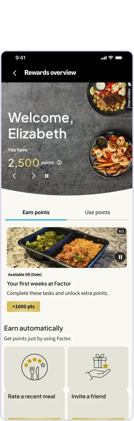
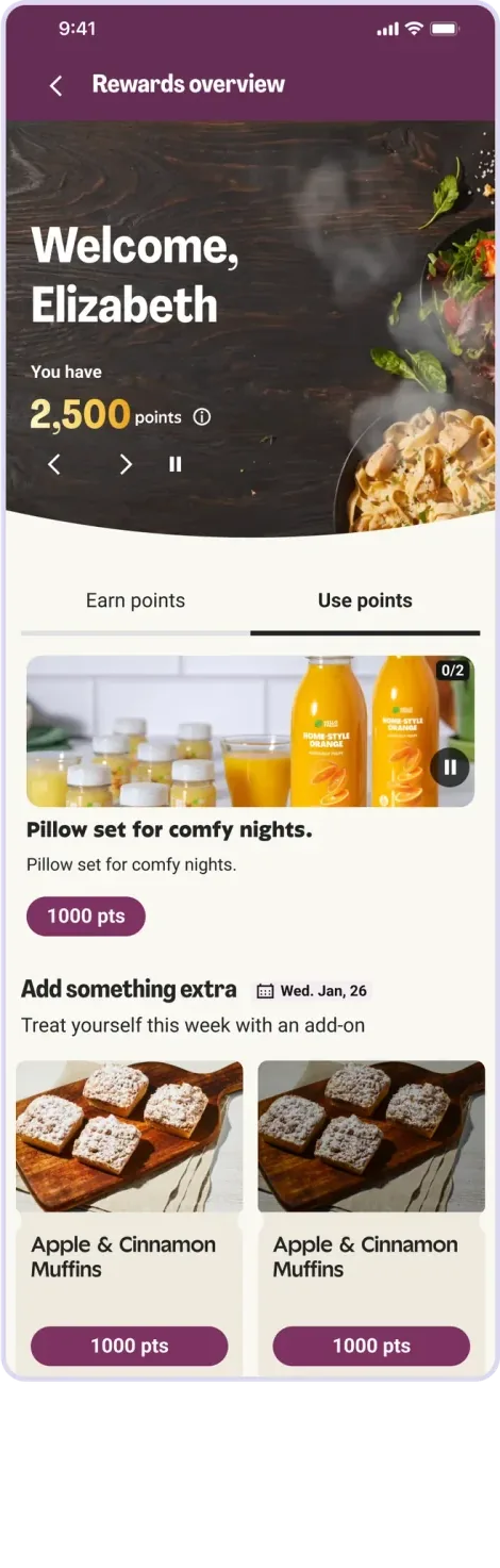
Loyalty 2.0
My role
Product and Motion Designer.
Team
Strategic design lead, 2 designers, 2 project managers, front end, react native, product marketing, and QA engineers.
Timeline
Q3 2025 - Q1 2026
The problem
Engagement on the first program was low because:
- Users were unaware they could get rewards, leaving benefits unused
- User engagement was low because everything was given automatically with barely any notification
- The few customers who discovered their vouchers felt frustrated by the lack of choice
Research and insights
Dissatisfied users desired spend-based progression rather than box-based. Users want to understand any point expiration to ensure they can be used. Using some quickly generated Magic Patterns prototypes, UXR ran moderated interviews to ensure that a new system of points would be easier to understand. The findings of these different interviews informed the final designs.
Later, 2 unmoderated usability testing were done to ensure redemption was easy to understand.
OOUX
Understanding what attributes are needed for the cards design
My process
Benchmarked best in class examples like Sephora and Starbucks
Strong branding, 3-4 tiers that drive aspiration, with large adoption through seamless optional opt-in,
Audited existing benefit structure and its problems.
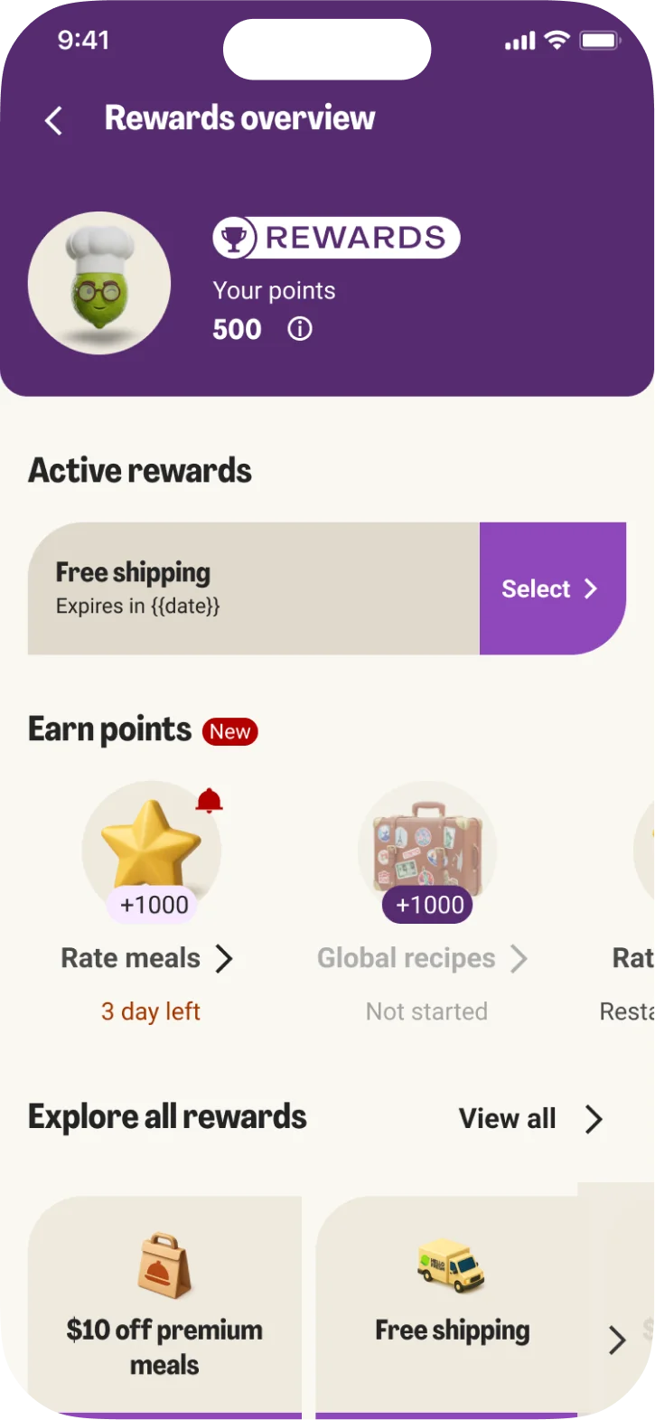
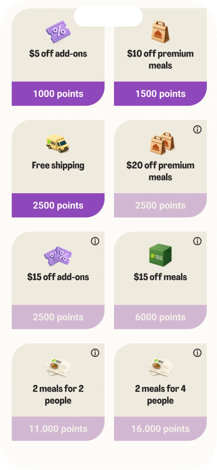
Replaced single-item vouchers with a multi-tiered rewards catalog, giving users the freedom to choose rewards that matched their tastes
Designed and tested new ux flows
Testing and understand areas of frictions introduced by this program and breaking down on sprint deliverables, I had to deliver always one sprint ahead so the devs could pick it up on time.
Built a design system and alignment with brand
A lot of stakeholder communication was needed for the launch of the program, from creatives to crm partners, and of course our own design system friends, since I had to create all new component for this.
The risks
For the first program, Loyalty had a top spot on the bottom navigation, however with information architecture changes to the app, the program was relegated to inside of profile reducing it’s visibility, as majority of opt-ins came from the bottom navigation.
The rewards offered at the beginning of the program are not exciting enough to make users want to redeem them.
Test findings
Users overwhelmingly view the loyalty program as an extension of their personal identity within the app, so being in profile makes sense.
Users expressed a desire for a Top Banner Widget or notification to see their point balance at all times without navigating deep into menus.
Creating the program
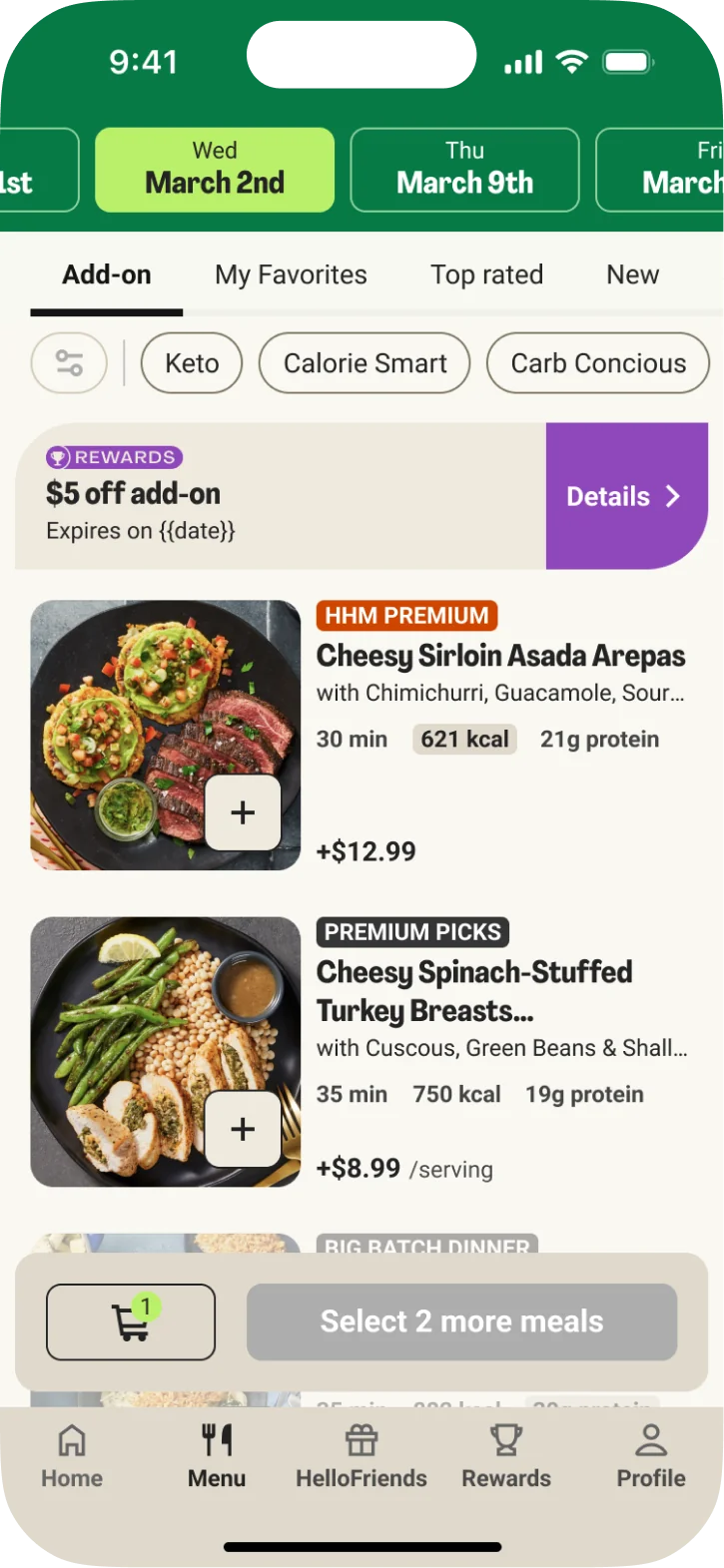
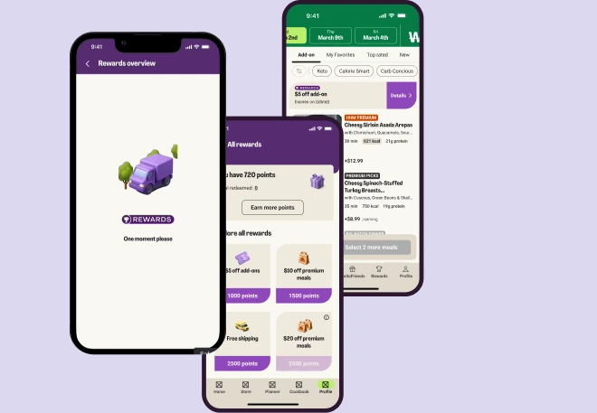
I worked with two squads on this project, one focused on the redemption aspect, and the other focusing of ways of earning points through challenges and orders.
My focus was mostly on the burning points aspect, creating a system that worked with the existing benefit system and its constraint.
But besides that I created the animations for loading statuses and moments of joy overall using protopie and lottie. Plus pitching the characters generated with ChatGPT to help the discussion with our creative team.
Impact and the future
- 5.1% Active User Churn with an statistically significant 24-week retention lift
- 4.6% New Customer Churn 24-week sustained cancellation reduction
- +4.3% Predicted 52-Week AOR increase for new cohorts
As we are having a brand revamp, we used this chance to improve the existing experience to match whats coming, something that feels more interactive and welcoming while we work to expand our catalogues.