Sustainability at HelloFresh
My role
Product Designer: from strategy, art direction, stakeholder management, to handover to devs
Team
Design, UX writing, Front-End, Project Managers, Sustainability managers
Timeline
Q3-Q4 2022
Tools
Figma, Usability hub
The problem
Balancing user needs: disposing of packaging, understanding meal kit sustainability practices, carbon footprint transparency. With technical constraints: Contentful limitations specially when it comes to hero banner images, this required close collaboration with developers.
Research and insights
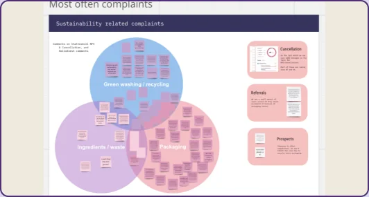
Explored cancellation reasons, user complaints, and external sources like reddit. Mapped connections & conducted competitor analysis.
Users see how it can help food waste but they are unsure if the packaging balances it out or creates more CO2.
The process
Feedback
Comprehensive critique involving not only our entire design team, but cross-functional teams & brands.
Design
Iterated content with UX writer & gained stakeholder approval. DesignOps led brand-aligned illustrations over 3 iterations.
Tested
Got it in front of users on a quick run to ensure no potential usability issues.
The result
Integrated educational content on sustainability across 7 redesigned pages, addressing key areas like carbon footprint, food waste, packaging disposal, and social practices. The final look would not have been possible without having such a strong illustrator in our team.
Results:
- Modules reused by other brands, leading to increased conversion rates.
- Recognized with Q1 2023 awards on Bringers of Joy.
- During usability testing no user found issues navigating through the different pages including our how to recycle our packaging.
Personal reflection: Would advocate for pushing past contentful barriers and challenging senior designers more.
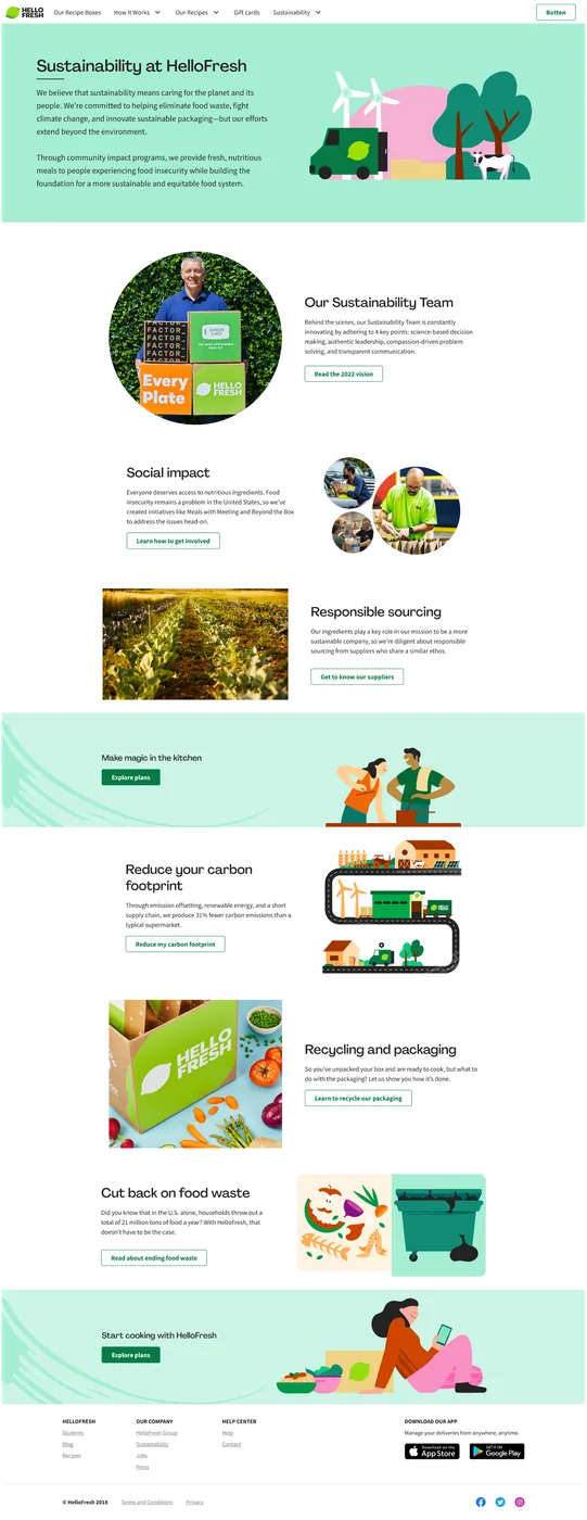
Main Sustainability Page
Connecting all other pages to one hub
Key learnings
During feedback sessions, stakeholders got quite stuck with the copy, if I had to work on this again, I would just 1) remind audience copy is not final. 2) use clear placeholder copy
Not getting too attached to designs, there were some internal discussions about one section of the design that created rough emotions, at the end of the day, we tested and settled.
Push for more animations against contentful limitations. Inhouse sections like the one created for the packaging, ended up being reused accross different brands because it was easy to use with simple animations that improve the look and feel of it.