One line address
My contribution
Lead Product Designer (End-to-End Ownership: Discovery, UX, Visual Craft, Prototyping, DIY Research & A/B Testing)
Team
Design, Front-End, Project Managers
Timeline
Q4 2024-Q4 2025
The problem
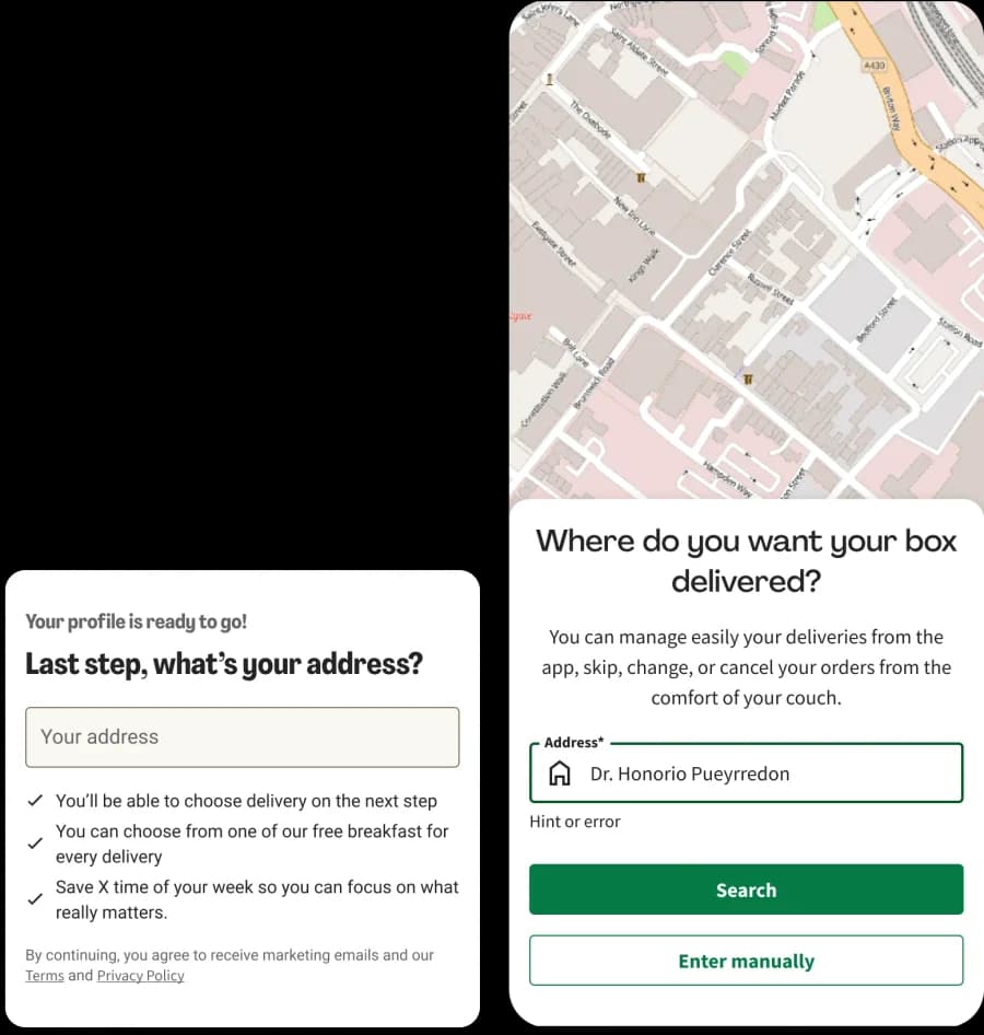
Long multi-field form, whose auto-complete feature was not working properly, resulting in users having to manually write, creating more mistakes during their first box delivery, and abandon checkout.
Only 51% of users completing the form used autocomplete, while 41% relied on browser autofill and 8% typed manually.
Research and insights
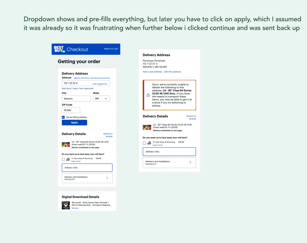
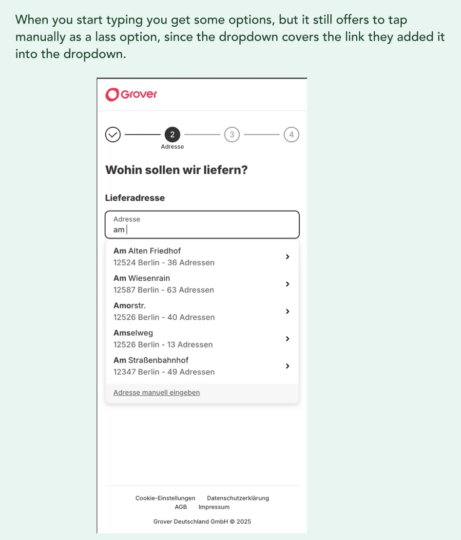
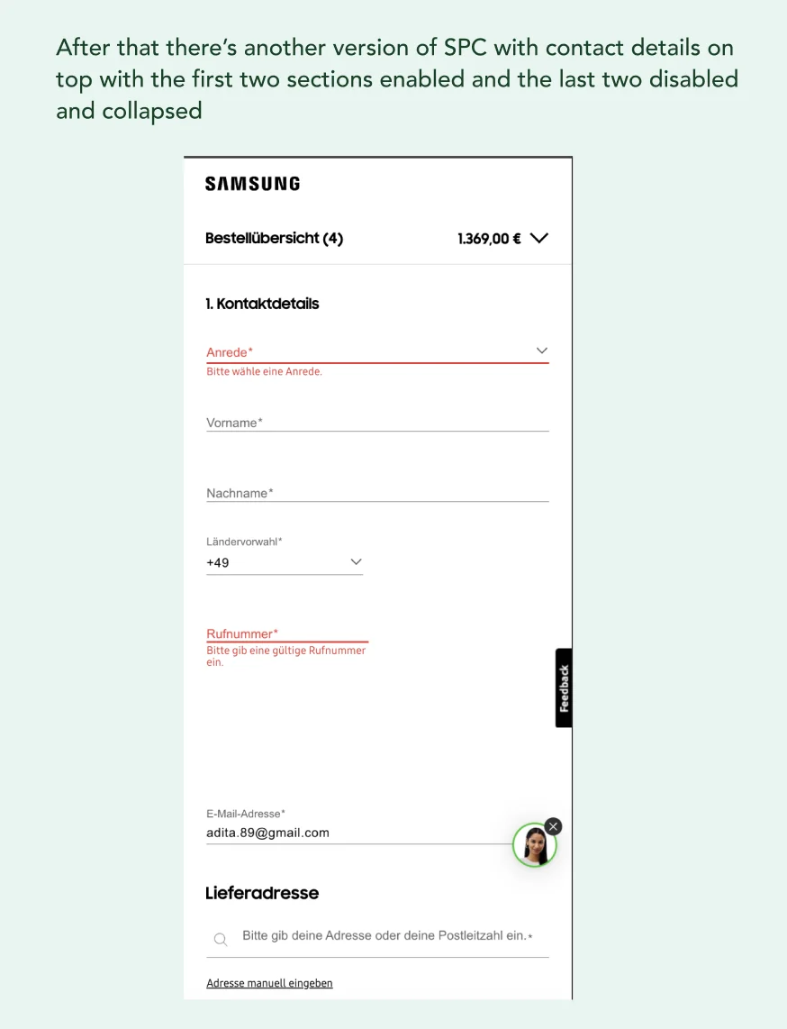
I conducted a competitor analysis to understand the panorama and best practices on address pages during the checkout experience, helping to refine the design. I looked into Samsung, BestBuy, Dyson, Grover, JustEat, and more.
Before launching an A/B test, I wanted to make user that I had covered potential usability issues by runnin an unmoderated test with over 10 users in both AU and US.
Users were able to successfully used the address component, with one indicating they would save time this way.
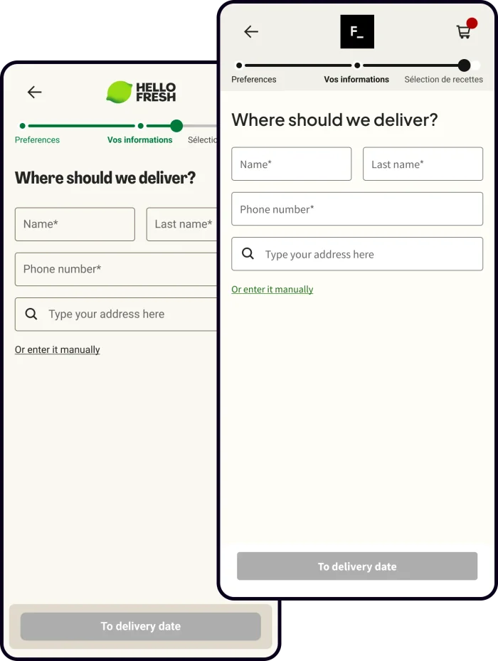
Shipped
Shipped a unified, single-line address input powered by Loqate across HelloFresh and Factor web & mobile viewports.
Integrated custom field rules for international markets, including German Hausnummer and Adresszusatz, as well as Irish EirCode validation.
Still kept an accessible manual entry flow, successfully serving the 5.7% of edge-case addresses that couldn't be surfaced via API
The impact
- Autocomplete Adoption surged from 52.4%, a +66.2% relative lift, Stat Sig
- Address field errors fell from 16.0% down to 2.3%, Stat Sig
- Step completion rate moved Address CTR from 77.2% to 78.9%, Stat Sig
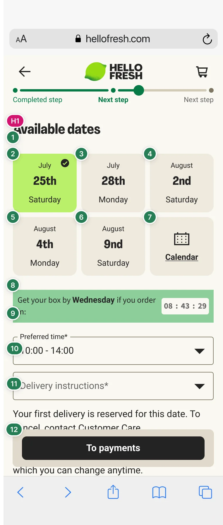
- More users reached payment
Key learnings
Working on a cross‑brand, cross‑country project taught me the power of design as infrastructure. But this was a very time consuming project because a thorough understanding of what not only works best on every brand but also what are the needs and differences of those brands.
While Address to Payment completion jumped by +2.3%, payment page completion saw a slight -2.0% dip. Making the address step easier allowed lower-intent users to progress further down the funnel, helping us consider where to increaser or remove friction.
Design can be very expensive, as the original idea of using a map through Loqate resulted to expensive to pursue.